atom: Cycling App
atom: Cycling App

With Atom, my team and I sought to provide a mobile space for cyclists to set aspirations and work towards achieving their goals. With this project we would run the whole process of mobile app development, from conception to a final prototype.
Table of Contents
Starting Out.
TEAM:
Lucas Bauer
Justin Chung
Andrew Mayfield
Kevin Vicente-Gonzales
The prospect of a fitness app is an intriguing one. There is no shortage of such apps spotting various mobile app stores, each catering to its own niche in the world of exercise. My team and I decided to challenge ourselves. We sought to create an app that could stand apart from the well-established fitness trackers, by crafting something simultaneously comprehensive and fully committed to the experience of the end user. I love solving a good design challenge, and my team was right there with me.
The vast majority of fitness tracking apps are unsurprisingly running related, considering the ease with which one can step outside and commence a jog. This style of app had therefore been handled thoroughly, with the popular apps garnering large attention from the running crowd. What we did not realize was how seemingly untapped the cycling market was on the app front. This appeared to be the route for us to take, so we did.
Competitive Audits.
Before doing anything, my team sought out app competitors to compare and contrast features both prominent and minute on both iOS and Android operating systems. Each member of the team researched at least one fitness tracking app thoroughly, writing down notes as we went. These notes were then transformed into a list of pros and cons.
-
The Good.
This app has a stopwatch, map, GPS. Allows for tracking of speed, distance, route, and calories. Data can be graph and trend analysis is provided.The Bad.
There are a lot of options and looks intimidating for someone like myself who is unfamiliar with biking.Misc Notes.
Possibly a tutorial would be nice. -
The Good.
Tracks weather, distance, heart rate, speed, elevation, time. Provides historical software user stats. Compatible with peripheral devices.The Bad.
User must first register an email and stats to start using.Misc Notes.
Seems a bit easier to navigate. The connections with ancillary devices would keep this app present with the user. -
The Good.
Multiple map options, Lifeline function to inform family/friends when you're out and can see your location, social tags, weather at location, facilities available at location, user photos, wearable connectivity.The Bad.
Info hierarchy is awkward at times (user wouldn't expect certain features to be in certain categories), naming conventions could use work (builds off of previous remark), Some potentially unnecessary features exist ("How to Get There" feature is redundant considering the app already gives directions)Misc Notes.
Used on Android. Very comprehensive application with loads of surprisingly useful features, but at moments this becomes its downfall. Would use. -
The Good.
Shows current conditions on trail, shows trail material (dirt, concrete, asphalt), option to show heat map of area, filter based on bike type, shows bike shops on map, options to download region maps, line graphs illustrate climb and descent of trailsThe Bad.
Initially an overload of features, so it takes a little longer than one would hope to fully get the hang of itMisc Notes.
Used on Android. Looks great and holds many thoughtful features. Would use. -
The Good.
App was very fluid, pipes data and social togetherThe Bad.
Account needed, not all features available as a resultMisc Notes.
Pinnacle of activity tracking, good design, amazing features
After looking through the features of what we considered to be our main competitors, we created some preliminary personas based on how we believed users would want to utilize the end product. These two user profiles were informed by our limited research and knowledge gathered whilst making our decision to create a cycling mobile app and our competitive analysis. We used these false profiles to decide what we should look for in our interviewees and what types of questions to ask them.
In order to learn as much information as possible about the needs of all cyclists, we needed to engage in some interviews. But before we could start performing interviews, we first needed to establish our list of questions and write up a consent form to be submitted to the Institutional Review Board (IRB) for approval. After our documents came back approved, my team and I began conducting interviews.
Prepping For Interviews.


The Interviews.
We began our research with a couple of interviews from convenience samples. One of these initial interviewees was selected at random on the Kennesaw State University Marietta Campus, and the other works for the university’s Sports and Recreation Department in the main office. Each interview was conducted by two team members: one to conduct the interview and one to take notes. The resulting notes were collected in a spreadsheet, and then pared down for concise review.
-
Exercise mainly consists of running with biking maybe 1-2 times a week
Mainly a runner, not a biker
Prefers cold weather but exercises year round
Mainly exercises for maintenance
Data was not primary to him. He has a rhythm to how he exercises and seems pretty content with it
Overall healthy lifestyle, been vegan for 2 years. This was a lifestyle choice driven by health, as opposed to other outside factors
Seemed like more of a tertiary user to an app.
Wears a helmet after accident he had.
His biking mostly consists of biking for transportation purposes.
-
Exercise consists of no more 20 minutes of Running, Strength Training, Cycling, & Yoga
Mainly outside whether it be cold or hot weather
The morning is ideal. However flexible with time as long as the exercise is achieved. Depending on what the activity is
Willing to have company. The goal is overall health. A drive for competition is her vehicle.
These activities are in controlled environments such as: sidewalks, races
Data is a huge part of her fitness journey. It is a way for her to view progress. Data such as — steps, duration, distance, & sleep
We were later able to conduct three more interviews. Two of these were held with employees of Kennesaw State University Sports and Recreation’s "Outdoor Adventures”, and one was with a student employee of the Bike Shop in the Recreation Center. Our goal was to have interviews with cyclists of varying degrees of experience, and we accomplished that. As with the initial interviews, each of these was conducted in teams of two.
After completing out interviews, we transformed our information into thick descriptions one to two paragraphs in length. This particular part of the process would allow us to better encapsulate the routines of our five interviewees regarding their cycling habits and to further understand their goals. The individuals were given placeholder names as to not display the real names of our participants.
Interview Descriptions.
-
Demographics — Matt is college-aged male.
On an average day Matt is a college student majoring in physics and his course work is his top priority. Matt will fit his workouts around his schedule getting them in either early in the morning or late at night shortly before the gym closes. Because of his busy schedule Matt prefers to workout alone and typically will bike as a form of transportation and his average distance is between 10-12 miles per week.
The local bike shop is where Matt will do most of his cycling shopping and he trusts the resident experts to help him with his biking equipment needs. The main pieces of equipment that he prefers is tight fitting clothing around his legs and sweaters to keep warm in cold weather. Matt will also wear a hat to keep up with his long hair as well as helmets.
-
Demographics — Rachael is a young adult female.
Rachael spends her work days leading the marketing team of a university sports and recreation department. She has a clear enjoyment for physical activity, considering the ease with which she conversed on the topic. She typically runs for exercise, but has recently began branching-out into yoga. She will go bike riding, generally on quieter roads with another rider, but mostly as a form of leisure rather than exercise. She will usually try to exercise in the morning, but the time ultimately varies.
She uses both wearables and apps. Regarding the former, she utilizes a Garmin when running for a more accurate counter of distance and speed. When she’s not using the Garmin, she is wearing a FitBit used to calculate her steps, time, and sleep. She is very competitive with her friends, and is constantly checking the FitBit mobile application to make sure she’s always on top. She has recently begun to move away from the use of her Garmin because updating maps required the use of a desktop computer: a process more tedious than she would prefer. Regarding mobile apps, Rachael has used MapMyRun in the past, but has more recently been using Strava and FitBit to track her exercise.
-
Demographics — Cheryl is an adult female.
Cheryl had been cycling for a few years but is a more avid runner. She is lives a very health oriented life and pursues healthy choices. She enjoys exercising including running, cycling, and partaking in yoga classes. Her husband and her husband both place health and wellness at the forefront of their lives. He works at Wahoo Fitness and is a more avid cyclist than she is. They will exercise together, but not exclusively.
She wears a Garmin to keep track of her fitness activity. She particularly likes it for its ability to keep track of her distances very accurately. It is also something she can wear and then sync to an app later. Though she’s spent a little time using apps, specifically Strava, she doesn’t use them much anymore. She didn’t seem particularly interested in notifications and updates. When she bikes, she typically rides with partner, not much with a group.
-
Demographics — Jack is a college-aged male.
Jack works in the bike shop on a university campus, repairing and maintaining students’ bikes. As we initiated our interview he was momentarily timid. But as we delved deeper into our conversation regarding cycling, his passion for the activity began to show.
He was newer to the world of cycling at the time of the interview. He had been involved in mountain biking for about a year and a half, riding a minimum of 2 to 3 hours a week. He was only interested in mountain biking and showed little interest in road cycling stating that “it seemed boring and repetitive.” Mountain biking was primarily a hobby for him. He had experience skateboarding as a kid and wanted to continue his competitive experiences through mountain biking. He mostly engages in riding with groups of people, rather than alone. He typically visits just one venue with multiple trails. He likes to ride trails over and over to learn the trail and set new PR’s, as competition is his most significant motivation.
He does not currently use any apps, wearables or devices when biking, however he was not opposed to using them. He said his current needs were met with just friends timing him and keeping track of his statistics. He had previously been exposed to the app “My Fitness Pal” and had used it with running. To him, being able to track his pace is the most important feature of an exercise application.
-
Demographics — Trevor is an middle-aged adult male.
Trevor is the head of the bike shop. The bike shop is located in the same university he attended as an undergrad. He is highly knowledge in the bike history, terminology and mechanics. Mechanics of how a small bike could exert so much power. “The Machine” as he calls the bike is what let to him entering the sport. He is a mechanic by trade. He has close to 20 years in the field. His transition in cycling started off as road cycling and later to mountain biking. Each of these variation has its niche. Depending on what and how to train. Mountain biking of a technical aspect to cycling because of the terrain changes while road cycling gives the thrill of going fast! Tracking data not much of an importance as it was in his training days. Nowadays the main goal is to keep up with the youngsters. Get the youngsters to breath heavily and earn a victory. To track he used to use a device that would mount to the bike. This device would track mileage as well as heartbeat.
Affinity Mapping.

After gathering all of our interview information, our next step was to create an affinity map. We began this process by handing out Post-Its to the four team members. We pulled up our previously composed interview descriptions on the television where we could all see them, and began to write down words that came to mind.
A four minute timer told us that we were done, and we organized the resulting notes on a large whiteboard. This initial round created multiple categories, so we held a few more jot sessions to flesh out each category individually. Once each category was finished, we worked together to organize the words within each category. The final affinity map would then be utilized to craft our new personas.
Crafting Personas.
Following the careful curation of our affinity map, we decided on what our final three personas would be. We believed that our primary user would be an experienced cyclist with some mountain biking experience who bikes regularly for general fitness and competition, that our secondary user would be a moderately experienced cyclist who bikes to stay fit and healthy and focuses on fitting their bike in their normal schedule, and that our tertiary user would be a new mountain biker who bikes for pleasure and is looking for new trails.
We fleshed these ideas out more with basic descriptions of the users’ motives and aspirations whilst using our mobile app.
-
Gender: Male
Age: 38
Occupation:
Web DeveloperType of Cycling:
Both but road cycling currentlyLocation:
Los Angeles suburbs
Goals:Improve consistently for upcoming races and events
Continue engaging with his local cycling community
Pain Points:
Some apps lack seamless GPS device connectivity
Chris is a 38-year-old web developer living in the Los Angeles suburbs. As a cycling enthusiast, he has spent a great deal of time engaged in both mountain and road biking, with more recent emphasis on the latter. As someone who already has a clearly defined cycling regime centered around his work schedule, Chris tends to focus more on continuously honing his own personal data and delving further into his local cycling community. He utilizes apps to track routes, particularly distance and elevation, but finds that many apps lack seamless connectivity with his GPS wearable.
Lifestyle.
General wellness, competitionConditions.
Schedule is important, weather would drive them to a stationary bike insideWearable.
Has wearableData.
Progress focused, wants to improve timesSocial.
Competition drives their social interactions. Sharing PR’s and competing with their community. Still cares about privacyRoutes.
Meets their distance and elevation rigor level. Close routes are nice though -
Gender: Female
Age: 27
Occupation:
AccountantType of Cycling:
Road Cycling onlyLocation:
Colorado Springs, COGoals
Maintaining a healthy lifestyle
Stay interested in her hobby
Stay active amidst a busy family and professional schedule
Pain Points
Following a route is difficult
Keeping her data and location information private and safe
Andi’s life is very schedule oriented. She is a mother of 2 and full time accountant, so finding time to explore hobbies has to fit in her already busy schedule. She does most of her cycling in the mornings or on the weekend with her husband. She has been active for most of her life and been cycling since she began college. Although she enjoys riding with her husband and friends, she is typically riding alone before work. Because of this, privacy is a big concern for her. She wants to keep track of the routes she has ridden but doesn’t want her specific route to be published. Another difficulty of riding in the morning is that she is riding in darker conditions at certain times throughout the year. This makes it fairly difficult to follow the routes that she has selected. Because of this, she typically rides the same routes repeatedly near her house. She’d like to see some new scenery and encounter new challenges if she can find routes that end near her house and have a similar level of rigor as her current routes.
Lifestyle.
General wellness, mildly competitiveConditions.
More schedule driven than weatherWearable.
Has wearableData.
Progress focused, wants to improve timesSocial.
Focused on privacy. Still competitive though.Routes.
Close routes are crucial. Meets their distance and elevation rigor level also though -
Gender: Male
Age: 22
Occupation:
Server (more flexible schedule)Type of Cycling:
Mountain Biking onlyLocation:
North CarolinaGoals
Exploring a new hobby
As a newcomer to the cycling world Owen primary focus is to understand the sport. He meets with his friends throughout the week to improve his times and knowledge of the sport. He does not care for competitions or tracking data at the moment. A common interest among friends is what drives him to improve on his times and technique. If he is cycling alone he will cycle if it fits his schedule for the week. If it does not it will not bother him too much. In finding new routes, Owen will often take his bike to work to and from work. If it is an off day it is not crucial for him to go out of his way to find a route to cycle.
Lifestyle.
Wellness, leisureConditions.
Deterred by weather, fits in scheduleWearable.
Does not have wearable, timed by friendsData.
Not focused on data, it’s interesting but they’re not actively seeking to improveSocial.
Not super interested in social features and interactionsRoutes.
The route can take me from point to point traveling. Convenience on my daily
Context Scenarios.
Now that our personas were created, we needed to create basic scenarios for each persona based on what we believed would be their most utilized features of the cycling app. We set a timer for five minutes and quickly jotted down a basic outline for each individual persona’s context scenario. We then expanded on the outlines to create full stories.
-
Chris has been planning his bi-monthly group cycling trip with a few of his friends, which he is scheduling through his phone app. He and three others have connected through social aspects of the app for the purpose of forming a group to train for an upcoming race. He has set a personal goal for himself within the app, and plans on achieving it before the race happens in a couple months.
Chris converses with his group on numerous occasions, suggesting a route that he found through the app a few months prior, and has ridden multiple times. He considers the route to have the perfect level of rigor for this particular ride.
Chris arrives at the locale ahead of the meeting time and waits on his companions to pull-in. As he waits, he pairs his new GPS wearable with the app for a more accurate depiction of location. After everyone arrives, they clock-in to the group on the application, and Chris sets himself as the primary rider so that his GPS route-tracking data is shared with the group.
The group of four embarks on their ride, and Chris takes the lead. As they ride, their phones keep track of their route, elevation, and pace.
Upon reaching the finishing point, the app updates with the group’s individual times. Chris is able to view his pace and compare it to previous trips he’s recorded on the same route. He has been improving, and is on track to achieving his goal on time. Proud of his accomplishment, he shares his time with others through the app.
-
It is a weeknight after Andi has put her children to bed. She is trying to find a new route that will take a similar amount of time to complete as her normal route so that she can ride in the morning before work without altering her schedule too much. When she goes to search for routes near her, she is mostly concerned with elevation and distance, but also would like the route to be a loop that begins and ends near her home.
After she has found a route that looks to meet her specifications, she is ready to go to bed. The next morning she wants to be able to quickly pull that route back up before she begins riding. It’s still a little dark as the sun hasn’t risen yet.
As she begins riding her route, she sets up devices to track her mileage and other data. She also puts in a headphone to listen to music along the ride. Since this is a new route, she is more aware of her surroundings than usual, keeping an eye out for cars and road signs. She’s keeping a close eye out for the route navigation to see where she needs to turn. During the rest of the ride Andi is mostly focused on riding as she normally would, pace-wise.
Andi realizes that she might have a little extra time during her ride, so she extends it by a bit. She doesn’t normally extend rides, but this is an unfamiliar one and allowed for it.
After finishing her ride, Andi takes a look at her total time and mileage and then quickly begins her routine of taking care of her kids and getting ready for work in the morning.
Andi spends a little time in the car thinking about whether she liked the route or not, but doesn’t dedicate too much thought to it. Later in the day at work, she takes a look at her phone to see a view of the route on a map and any other statistics that look important. Overall, she enjoyed riding a different route and would like to add a few more routes to her routine, but would like to know her routes a little better.
-
It is Sunday morning and Owen is laying down on a chair in his apartment watching a show on the television. As Owen watches his show he gets a text from his friend, an avid cyclist. His friend is asking him if he could meet them at a new route later in the day. Owen unfamiliar with the route opens an app to view the route.
He notices mile stamps as well as the difficulty level of the route. This bit of information helps him to understand how strenuous the route would be. The app also alerts him of how he would compare to similar routes in the past. With this information in mind he texts his friend.
Owen and his friend decide on a time to meet and how to get to the location.
At the start of the 19 mile cycling journey Owen reminds his friend to keep track of his time since he does not own a wearable. His friend describes the terrain a bit because Owen is still a tad unfamiliar with the area.
One hour later around 6 PM Owen and his friend finish the 19 mile journey. Afterwards his friend asks Owen if he would like to view the data. Owen declines the offer. The only data that interests him is the duration of the route. His friend gladly tells him the time it took and they both part ways.
Deciding on Features.
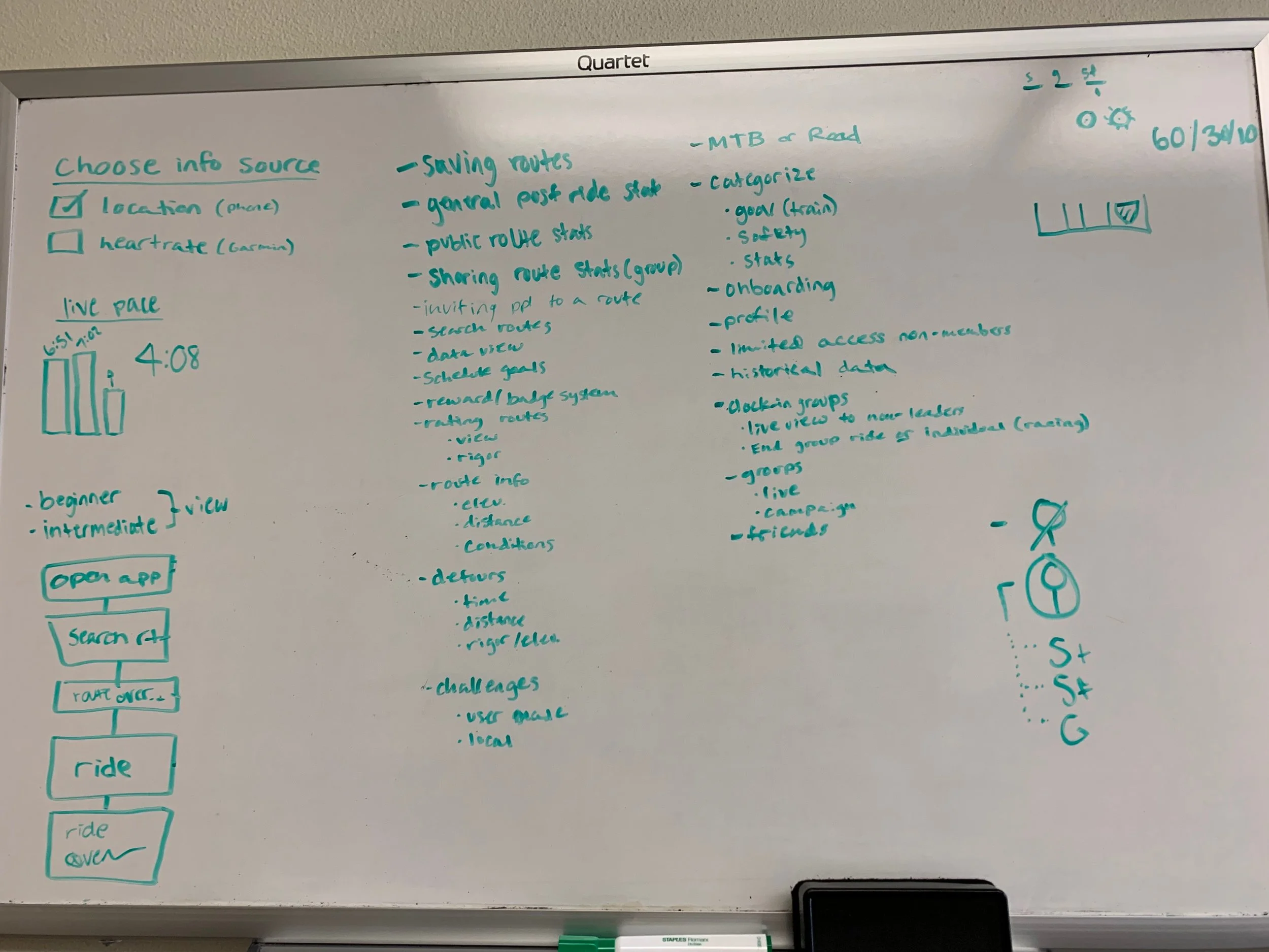
In order to decide on what features would be important to our app, we referenced not only our persona descriptions and context scenarios, but also the features of our competitors as outlined in our competitive audit. Cross-referencing our persona information with the pros and cons discovered through our audit helped us define the most important features for our users.
Key Path Validation Scenarios.
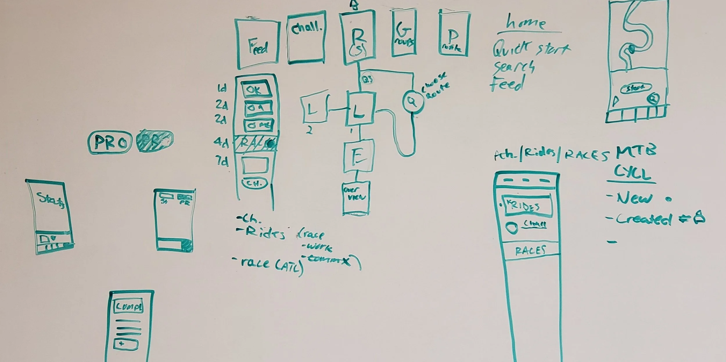
Our context scenarios were then utilized to create a keypath scenario: how the primary function of our application would flow. Each team member took a few minutes to sketch out how we believe this flow would go. Together we decided that our primary task was to view a map and route, based on the most recurring needs of our personas. Thus, our app would put this feature up-front for the easiest possible access.


We simultaneously began working on our validation scenarios. These scenarios would be centered around achieving secondary tasks such as viewing your profile or accepting a challenge from a friend.

Noticing the correlating elements in each of our keypath and validation scenarios, we were finally able to decide on the way the app would flow.

Wireframing.
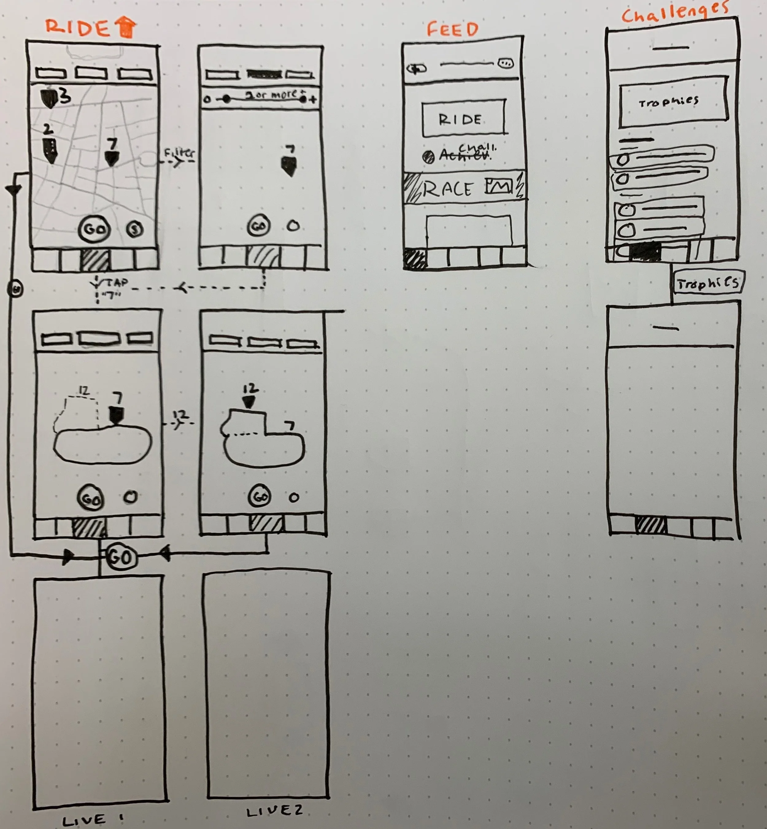
The next step was to begin our wireframing based on the data collected from our various scenarios. Lucas used dot paper to sketch out the various pages, as the rest of us fed input. Together we worked on implementing as many features as possible, while also trying to keep the design from becoming too overwhelmingly clustered.
Then we brought the page design and flow concepts from the page into Adobe Xd. This final mock-up would then be utilized in the creation of the prototype.

Our First Prototype.
While the wireframing process was imperative to deciding on the structure of the final app, the prototyping is where the design would begin to be implemented. Our team needed to decide how we wanted the final application to look and feel, and these decisions would be made through color choice, fonts used, icon art, and various interactive elements.
We chose a singular color with which to begin our prototyping phase; a very bright blue verging on purple. As we would later find out, while very attractive on its own, this color did not play well with others.
We established a semi-style guide that included potential colors, our font choices which included various weights of the Circular font, and parameters regarding the spacing of certain items from page to page.
Each team member worked on a portion of the app prototype, my personal contribution being the design and function of the feed page. Afterwards, the pages were adjusted slightly to retain style coherence for user testing purposes.
Testing Prep.
Next it was time to begin our user testing process. Before commencing the with actual procedure of questioning participants, we needed to establish a list of scenarios for the users to fulfill as a test of the prototype’s main functions on its 5 main pages.
Tasks:
Ride Page - filter rides to 3 miles and above. Select 4-mile route. Favorite route. Find more information about the route. Exit route. *hit ride icon
Challenges Page - Check out more info on the Iron Lungs Challenge and delete the Marathoner challenge
Profile Page - Go to the profile page. Find most recent activity. Find detail stats
Groups Page - Browse through some groups and then try to find a group in Smyrna.
Feed Page - Find more info about a Bike Roswell! Mayor’s Ride. Find more information about the challenge.
After setting the tasks, we compiled a brief list of questions that would be given to the users after they completed the test. These questions would be utilized to glean additional insight on the beliefs the user held post-test regarding the state of the prototype and help us decide what could be done to improve existing features.
1. What is the standout feature of the app?
2. How do you feel about the color scheme?
3. Did the content of the page match the icon of the page?
4. Was there anything you felt was missing?
5. Was there anything you felt was unnecessary?
We also decided to perform a System Usability Scale (SUS) alongside our test to get a set of quantitative data as well. This test would provide us with a number on the scale from 0-100 and give us a numeric goal to achieve by the end of our testing and refining iteration process.
Usability Testing.
We began our usability testing on the Kennesaw State University main campus during the National Convention for Undergraduate Research (NCUR) where we expected many people would be happy to participate in our research project. We were able to gather three NCUR participants for testing and two interaction designers from our major. We believed this blend of researchers and people from our field would yield the best possible results.
During the tests Lucas was charged as the moderator, me as the observer/note-taker, and Kevin and Justin worked as questionnaire and SUS handlers/distributors. The notes I gathered are as follows:
Participant 1:
Filters were found easily, but closing them was difficult
Clicked “Quit” to close out of the Iron Lungs Challenge.
Preferred the gray version of the Feed page.
Participant 2:
Had trouble with the filters. Wanted to tap outside of the box to exit rather than clicking the filter button again.
Noted that the route wasn’t still highlighted after exiting its information page.
The “Share” button was ambiguous in meaning.
Also used “Quit” to exit the challenge.
The difference between Feed elements is confusing.
Participant 3:
Pulling up more information on the route was unclear. Had to be shown the process.
Unsure of where the “Share” button would lead.
Feed page is confusing. Achievements look like advertisements.
Participant 4:
Opened the “More” filter page to choose distance.
Did not know what “Quit” did. Expressed that they believed it could either close out of the pop-up or completely end the challenge.
The purpose of the “Share” button was clear to them.
Purple makes the Feed stand out, but the Events look kind of like advertisements.
Participant 5:
Navigated pretty fluidly, but as seen with others, flaws in the flow of the prototype were prevalent.
Reiterated the concerns regarding the naming conventions “Share” and “Quit”.
Liked the idea of transforming the feed into a more recognized style a la Facebook or Instagram.
After the test was completed, the questionnaires and SUS tests were administered by Kevin and Justin.


After we completed our 5 usability tests and collected all of our data, it was time to take what we’d learned about our prototype and make changes accordingly.
Notable issues regarding the prototype included the naming of “Share” and “Quit” being too ambiguous, the Feed appearing to be rife with advertisements from multiple angles, some issues with the color choices, and some minor quirks with the filter feature on our Ride page.
For the most part, navigation seemed to come intuitively to our participants as they generally had low to no difficulty completing the prompted tasks. We began to implement these changes to create a second prototype.